





Calendar heatmaps and daily bar strips that show data completeness over time.
Use it to monitor instrument data quality or to track the availability of any time series. It returns a matplotlib Figure with one subplot per calendar year, with each day colored on a red-yellow-green gradient by its completeness.
Input: Excel (.xlsx/.xls) or CSV with date and completeness (0–100) columns.
Output: A matplotlib.figure.Figure — save or display as needed.
There are two kinds of figure:
-
kind="calendar"(default): a GitHub contribution-style heatmap, with one tile per day on a Mon–Sun × week grid.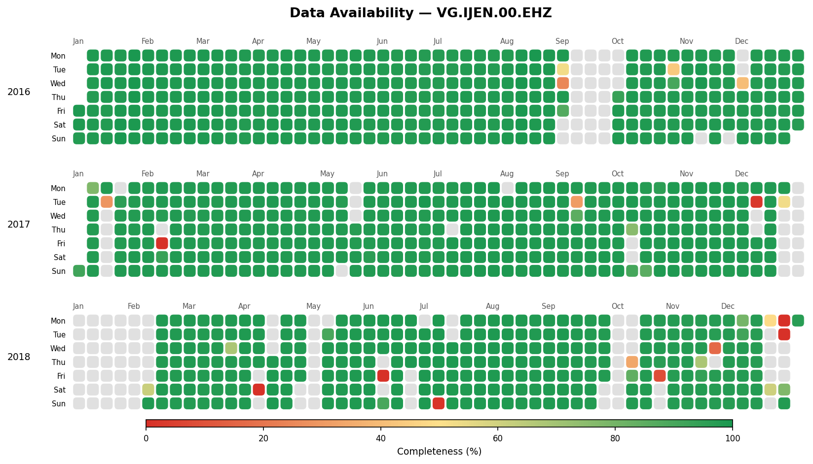
-
kind="bar": a status-page style strip, with one thin bar per day and month labels underneath.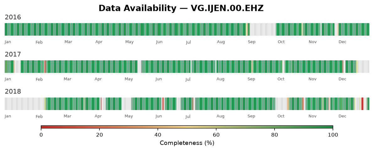
pip install data-availabilityOr with uv:
uv add data-availabilityimport matplotlib.pyplot as plt
from data_availability import PlotAvailability
fig = (
PlotAvailability("data.xlsx")
.select(years="2023")
.plot(title="Sensor Uptime", tile_shape="squircle")
)
plt.savefig("availability.png", dpi=150, bbox_inches="tight")
# Same data as a daily bar strip
fig = (
PlotAvailability("data.xlsx")
.select(years=["2022", "2023"])
.plot(title="Sensor Uptime", kind="bar", fig_width=10)
)
fig.savefig("availability-bar.png", dpi=150, bbox_inches="tight")from data_availability import plot_from_file, plot_from_df
# From a file
fig = plot_from_file("data.csv", title="My Data")
# From a pre-loaded DataFrame
import pandas as pd
df = pd.read_csv("data.csv")
fig = plot_from_df(df, title="My Data")from data_availability import SeismicAvailability
sa = SeismicAvailability(
start_date="2023-01-01",
end_date="2023-12-31",
sds_dir="/data/sds",
station="IJEN",
channel="EHZ",
network="VG",
location="00",
n_jobs=4,
)
fig = sa.plot(title="IJEN EHZ Availability 2023")
fig.savefig("ijen_availability.png", dpi=150, bbox_inches="tight")
fig = sa.plot(title="IJEN EHZ Availability 2023", kind="bar")
# Optional: persist the per-day completeness DataFrame
sa.to_excel() # writes <NSLC>_<start>-<end>.xlsx into CWD
sa.to_excel("ijen.xlsx") # or pass an explicit path
records = sa.to_json() # or serialise to JSON recordsOn Windows, wrap the call in
if __name__ == "__main__":when usingn_jobs > 1— Python'sspawnstart method requires it.
Fluent builder class for Excel/CSV data.
fig = (
    PlotAvailability("data.xlsx")
    .select(
        date_column="date",          # column name for dates
        completeness_column="completeness",  # column name for values (0–100)
        years=["2022", "2023"],      # filter to specific years (optional)
    )
    .plot(
        title="Data Availability",
        kind="calendar",             # "calendar" (heatmap) or "bar" (daily strip)
        hspace=None,                 # default: 0.2 calendar, 1.4 bar
        figsize_per_year=None,       # inches per year; default: 2.2 calendar, 1.2 bar
        fig_width=20.0,              # figure width in inches
        missing_color="#e0e0e0",     # days absent from the data
        cbar_bottom=20,              # px between last subplot and colorbar
        cbar_height=10,              # colorbar height in px
        title_pad=40,                # px between first subplot and title
        tile_shape="square",         # calendar only: "square" or "squircle"
        tile_gap=0.9,                # calendar only: tile size (< 1 adds gaps)
        bar_gap=0.8,                 # bar only: bar width (< 1 adds gaps)
        color_bins=None,             # None = continuous; int or edge list = discrete bins
    )
)
tile_shape and tile_gap are ignored when kind="bar", and bar_gap is
ignored when kind="calendar". Any other kind raises ValueError.
color_bins changes the continuous color scale into discrete completeness classes.
It works for both kinds and on every plot* entry point:
.plot(color_bins=5)                     # 0–20, 20–40, 40–60, 60–80, 80–100
.plot(color_bins=4)                     # 0–25, 25–50, 50–75, 75–100
.plot(color_bins=[0, 50, 80, 95, 100])  # custom edges (must start at 0, end at 100)
Each bin covers [lo, hi), except that exactly 100% falls in the top bin.
Reads a SeisComP Data Structure (SDS) archive, computes per-day completeness,
and renders the heatmap. Supports parallel processing via n_jobs.
sa = SeismicAvailability(
    start_date="2023-01-01",  # YYYY-MM-DD
    end_date="2023-12-31",    # YYYY-MM-DD (inclusive)
    sds_dir="/data/sds",      # root of the SDS archive
    station="IJEN",
    channel="EHZ",
    network="VG",
    location="00",
    channel_type="D",         # SDS data-type qualifier (default "D")
    n_jobs=1,                 # parallel workers (default 1 = serial)
    verbose=False,
)

sa.plot(title="IJEN EHZ")    # returns a matplotlib Figure; accepts the same
                             # kwargs as PlotAvailability.plot() (title defaults to NSLC)
sa.get_df()                  # DataFrame: nslc, date, filepath, completeness
sa.to_json()                 # list of records
sa.to_excel(path=None)       # write DataFrame to Excel; default filename in CWD
With kind="calendar", .plot() drops zero-completeness days, so days
with no data render as missing_color (grey) instead of red at the bottom
of the colormap. With kind="bar", those days are kept and render red, so
outages stand out in the strip. Call .get_df() for the unfiltered per-day
results.
Functional alternatives that accept the same keyword arguments as .plot() (including kind) plus date_column and completeness_column.
These don't filter out zero-completeness rows, so those days render red in both kinds.
Load and normalize an Excel or CSV file into a DataFrame ready for plotting.
A stderr console handler at INFO level is attached automatically on
import — you don't need to configure anything to see log output. Opt into
rotating daily file logs (general + errors) by calling configure_logging:
from data_availability import configure_logging

configure_logging(log_dir="./logs", console_level="DEBUG")
The library never creates directories or writes files on import.
| Column | Type | Notes |
|---|---|---|
date |
date string or datetime | parsed automatically |
completeness |
float | clipped to [0, 100]; strings replaced with NaN |
Column names are configurable via date_column / completeness_column parameters.
# Install with dev extras
uv sync --group dev

# Run the example (writes output.png and output-bar.png)
uv run main.py

# Lint and format
uv run ruff check --fix .
uv run ruff format .

# Type check
uv run ty checkMIT © Martanto